c4d.gui.GeDialog
A dialog is a window or a panel, in which buttons, edit boxes, icons, images, and other things are put upon. These buttons, sliders, icons, etc are called widgets. Dialogs act as interfaces for a plugin. You are able to customize or derive a dialog box that will act as an interface for your plugin. Most dialog boxes are derived off of
GeDialog
class.
The reason you care about dialogs is that you want anyone to be able to use your plugin, and you want it to be easier to use. Plus it is a lot cooler when you have tons of widgets to play with. There is no other (easy) interactive way for you to interface with the user than with a dialog.
c4d.gui.
GeDialog
GeDialog.CreateLayout()
GeDialog.Message()
GeDialog.InitValues()
GeDialog.CoreMessage()
GeDialog.Command()
GeDialog.AskClose()
GeDialog.Timer()
GeDialog.DestroyWindow()
GeDialog.Open()
GeDialog.Close()
GeDialog.SendMessage()
GeDialog.SendParentMessage()
GeDialog.GetId()
GeDialog.IsOpen()
GeDialog.IsVisible()
GeDialog.SetTimer()
GeDialog.SetTitle()
GeDialog.Enable()
GeDialog.Restore()
GeDialog.CheckValueRanges()
GeDialog.Local2Global()
GeDialog.Global2Local()
GeDialog.Local2Screen()
GeDialog.Screen2Local()
GeDialog.GetColorRGB()
GeDialog.SetDefaultColor()
GeDialog.AddCheckbox()
GeDialog.AddButton()
GeDialog.AddStaticText()
GeDialog.AddEditText()
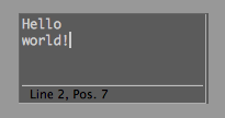
GeDialog.AddMultiLineEditText()
GeDialog.AddEditNumber()
GeDialog.AddEditNumberArrows()
GeDialog.AddSlider()
GeDialog.AddEditSlider()
GeDialog.AddColorField()
GeDialog.AddColorChooser()
GeDialog.AddRadioGroup()
GeDialog.AddRadioButton()
GeDialog.AddRadioText()
GeDialog.AddComboBox()
GeDialog.AddPopupButton()
NEW
GeDialog.AddSeparatorH()
GeDialog.AddSeparatorV()
GeDialog.AddChild()
GeDialog.FreeChildren()
GeDialog.SetPopup()
NEW
GeDialog.AddChildren()
NEW
GeDialog.AddUserArea()
GeDialog.AttachUserArea()
GeDialog.AddSubDialog()
NEW
GeDialog.AttachSubDialog()
NEW
GeDialog.AddDlgGroup()
GeDialog.GetDragPosition()
GeDialog.GetDragObject()
GeDialog.SetDragDestination()
GeDialog.CheckDropArea()
GeDialog.GroupBeginInMenuLine()
GeDialog.ScrollGroupBegin()
GeDialog.TabGroupBegin()
GeDialog.GroupBegin()
GeDialog.GroupEnd()
GeDialog.GroupWeightsSave()
GeDialog.GroupWeightsLoad()
GeDialog.GroupSpace()
GeDialog.GroupBorder()
GeDialog.GroupBorderNoTitle()
GeDialog.GroupBorderSpace()
GeDialog.GetBool()
GeDialog.GetLong()
GeDialog.GetInt32()
GeDialog.GetReal()
GeDialog.GetFloat()
GeDialog.GetVector()
GeDialog.GetString()
GeDialog.GetColorField()
GeDialog.GetTime()
GeDialog.GetFilename()
GeDialog.CheckTristateChange()
GeDialog.SetBool()
GeDialog.SetLong()
GeDialog.SetInt32()
GeDialog.SetReal()
GeDialog.SetFloat()
GeDialog.SetMeter()
GeDialog.SetDegree()
GeDialog.SetPercent()
GeDialog.SetTime()
GeDialog.SetString()
GeDialog.SetColorField()
GeDialog.SetFilename()
GeDialog.SetMultiLinePos()
GeDialog.SetMultiLineMode()
GeDialog.LayoutChanged()
GeDialog.LayoutChangedNoRedraw()
GeDialog.Activate()
GeDialog.IsActive()
GeDialog.LayoutFlushGroup()
GeDialog.RemoveElement()
GeDialog.HideElement()
GeDialog.MenuFlushAll()
GeDialog.MenuSubBegin()
GeDialog.MenuSubEnd()
GeDialog.MenuAddCommand()
GeDialog.MenuAddString()
GeDialog.MenuAddSeparator()
GeDialog.MenuFinished()
GeDialog.MenuInitString()
- c4d.gui.GeDialog
GeDialog.
CreateLayout
(
self
)
Override - Called when Cinema 4D is about to display the dialog.
| Return type: | bool |
|---|---|
| Returns: | True if successful, or False to signalize an error. |
GeDialog.
Message
(
self
,
msg
,
result
)
Override - Override this function if you want to react to more messages than covered by the other virtual functions. Normally this is not necessary.
Note
Be sure to include a call to the parent version of this function:
from c4d import gui
from gui import GeDialog
def Message(self, msg, result):
  return GeDialog.Message(self, msg, result)
| Parameters: |
|
|---|---|
| Return type: |
int |
| Returns: |
The return value depends on the message. |
GeDialog.
InitValues
(
self
)
Called when the dialog is initialized by the GUI.
| Return type: | bool |
|---|---|
| Returns: | True if successful, or False to signalize an error. |
GeDialog.
CoreMessage
(
self
,
id
,
msg
)
Override this function if you want to react to Cinema 4D core messages. The original message is stored in msg.
| Parameters: |
|
||||||||||||||||||||||||||||||||||||||||||||||||||||
|---|---|---|---|---|---|---|---|---|---|---|---|---|---|---|---|---|---|---|---|---|---|---|---|---|---|---|---|---|---|---|---|---|---|---|---|---|---|---|---|---|---|---|---|---|---|---|---|---|---|---|---|---|---|
| Return type: |
bool |
||||||||||||||||||||||||||||||||||||||||||||||||||||
| Returns: |
Currently not used - but you have to return a bool value. |
GeDialog.
Command
(
self
,
id
,
msg
)
Override this function if you want to react to user clicks. Whenever the user clicks on a gadget and/or changes its value this function will be called. It is also called when a string menu item is selected. Override it to handle such events.
Note
Remember that you need to call
StopAllThreads()
before making modifications to the scene.
| Parameters: |
|
|||||||||||||||||||||
|---|---|---|---|---|---|---|---|---|---|---|---|---|---|---|---|---|---|---|---|---|---|---|
| Return type: |
bool |
|||||||||||||||||||||
| Returns: |
False if there was an error, otherwise True . |
GeDialog.
AskClose
(
self
)
If the user wants to close the dialog with the OK button this function will be called. Override it to avoid closing the dialog if an error situation has occured. If you return False everything will be as usual, but if you return True the dialog won’t close.
Warning
Please pay attention to the result value. True means, it will not close.
| Return type: | bool |
|---|---|
| Returns: | True if the dialog shouldn’t be closed, False if it should. |
GeDialog.
Timer
(
self
,
msg
)
If you subscribe to timer events using
SetTimer()
(x), this function is called every x’th millisecond.
| Parameters: | msg ( BaseContainer ) – The raw timer message. |
|---|
GeDialog.
DestroyWindow
(
self
)
Override this method - this function is called when the dialog is about to be closed temporarily, for example for layout switching.
GeDialog.
Open
(
dlgtype[, pluginid=0][, xpos=-1][, ypos=-1][, defaultw=0][, defaulth=0][, subid=0]
)
Opens a dialog.
| Parameters: |
|
||||||||||||||||||
|---|---|---|---|---|---|---|---|---|---|---|---|---|---|---|---|---|---|---|---|
| Return type: |
bool |
||||||||||||||||||
| Returns: |
True if successfully opened, otherwise False . |
GeDialog.
Restore
(
pluginid
,
secret
)
Used to restore an asynchronous dialog that has been placed in the users layout. Just use this method in
CommandData.RestoreLayout()
.
| Parameters: |
|
|---|---|
| Return type: |
bool |
| Returns: |
True if successfully restored, otherwise False . |
GeDialog.
GetInputState
(
askdevice
,
askchannel
,
res
)
Polls a certain channel of a device for the current input state. If the return value is True , the container stored in res is just like an input event message, otherwise no state was available.
See also
| Parameters: |
|
||||||||||||||||||
|---|---|---|---|---|---|---|---|---|---|---|---|---|---|---|---|---|---|---|---|
| Return type: |
bool |
||||||||||||||||||
| Returns: |
True if a state could be retrieved, otherwise False . |
GeDialog.
GetInputEvent
(
askdevice
,
res
)
Gets the next input event for a certain device from the event queue. If the return value is True , the container stored in res is just like an input event message, otherwise no event was available.
See also
| Parameters: |
|
||||
|---|---|---|---|---|---|
| Return type: |
bool |
||||
| Returns: |
True if the event could be retrieved, otherwise False . |
GeDialog.
KillEvents
(
)
Flushes all events from the window message queue. For example if you loop while the mouse is down (polling) you can call this command to flush all keydowns/mouseclicks that are made during the loop.
GeDialog.
Local2Global
(
)
Transforms local coordinates (relative to the top left corner of the dialog) to global coordinates (relative to the top left corner of the physical window). Result is a dict with member keys x and y of type int .
| Return type: | dict{ x : int, y : int} |
|---|---|
| Returns: | The converted coordinates or None . |
GeDialog.
Global2Local
(
)
Transforms global coordinates (relative to the top left corner of the physical window) to local coordinates (relative to the top left corner of the dialog). Result is a dict with member keys x and y of type int .
| Return type: | dict{ x : int, y : int} |
|---|---|
| Returns: | The converted coordinates or None . |
GeDialog.
Local2Screen
(
)
Transforms local coordinates (relative to the top left corner of the dialog) to screen coordinates (relative to the top left corner of the system screen). Result is a dict with member keys x and y of type int .
| Return type: | dict{ x : int, y : int} |
|---|---|
| Returns: | The converted coordinates or None . |
GeDialog.
Screen2Local
(
)
Transforms screen coordinates (relative to the top left corner of the system screen) to local coordinates (relative to the top left corner of the dialog). Result is a dict with member keys x and y of type int .
| Return type: | dict{ x : int, y : int} |
|---|---|
| Returns: | The converted coordinates or None . |
GeDialog.
SetDefaultColor
(
id
,
colorid
,
color
)
Set The default color for GUI elements.
| Parameters: |
|
|---|
GeDialog.
GetColorRGB
(
colorid
)
Gets the RGB values associated with a color code.
| Parameters: |
colorid
(
int
) –
The color value.
|
||||||||||||||||||||||||||||||||||||||||||||||||||||||||
|---|---|---|---|---|---|---|---|---|---|---|---|---|---|---|---|---|---|---|---|---|---|---|---|---|---|---|---|---|---|---|---|---|---|---|---|---|---|---|---|---|---|---|---|---|---|---|---|---|---|---|---|---|---|---|---|---|---|
| Return type: | dict{ r : int, g : int, b : int} | ||||||||||||||||||||||||||||||||||||||||||||||||||||||||
| Returns: | The color in the dict with the keys x , y and z . |
GeDialog.
CheckValueRanges
(
)
Checks if the value for all input fields are within the allowed range.
| Return type: | bool |
|---|---|
| Returns: | True if everything is alright, or False if any field is wrong. |
GeDialog.
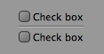
AddCheckbox
(
id, flags[, initw=0][, inith=0][, name=”“]
)
Add a checkbox to the dialog.
| Parameters: |
|
||||||||||||||||||||||||||||
|---|---|---|---|---|---|---|---|---|---|---|---|---|---|---|---|---|---|---|---|---|---|---|---|---|---|---|---|---|---|
| Return type: | |||||||||||||||||||||||||||||
| Returns: |
The added gadget. |
GeDialog.
AddButton
(
id, flags[, initw=0][, inith=0][, name=”“]
)
Add a button to the dialog.
| Parameters: |
|
||||||||||||||||||||||||||||
|---|---|---|---|---|---|---|---|---|---|---|---|---|---|---|---|---|---|---|---|---|---|---|---|---|---|---|---|---|---|
| Return type: | |||||||||||||||||||||||||||||
| Returns: |
The added gadget. |
GeDialog.
AddStaticText
(
id, flags[, initw=0][, inith=0][, name=”“][borderstyle=0]
)
Adds a static text field to the layout.
| Parameters: |
|
||||||||||||||||||||||||||||||||||||||||||||||||||||||||||||||||||||||||||
|---|---|---|---|---|---|---|---|---|---|---|---|---|---|---|---|---|---|---|---|---|---|---|---|---|---|---|---|---|---|---|---|---|---|---|---|---|---|---|---|---|---|---|---|---|---|---|---|---|---|---|---|---|---|---|---|---|---|---|---|---|---|---|---|---|---|---|---|---|---|---|---|---|---|---|---|
| Return type: | |||||||||||||||||||||||||||||||||||||||||||||||||||||||||||||||||||||||||||
| Returns: |
The added gadget. |
GeDialog.
AddEditText
(
id, flags[, initw=0][, inith=0][, name=”“][editflags=0]
)
Adds an editable text field to the layout.
| Parameters: |
|
||||||||||||||||||||||||||||||||
|---|---|---|---|---|---|---|---|---|---|---|---|---|---|---|---|---|---|---|---|---|---|---|---|---|---|---|---|---|---|---|---|---|---|
| Return type: | |||||||||||||||||||||||||||||||||
| Returns: |
The added gadget. |
GeDialog.
AddMultiLineEditText
(
id, flags[, initw=0][, inith=0][, style=0]
)
Adds an editable text field with multiple lines to the layout.
| Parameters: |
|
||||||||||||||||||||||||||||||||||||||||||
|---|---|---|---|---|---|---|---|---|---|---|---|---|---|---|---|---|---|---|---|---|---|---|---|---|---|---|---|---|---|---|---|---|---|---|---|---|---|---|---|---|---|---|---|
| Return type: | |||||||||||||||||||||||||||||||||||||||||||
| Returns: |
The added gadget. |
GeDialog.
AddEditNumber
(
id, flags[, initw=80][, inith=0]
)
Adds an editable number field to the layout.
| Parameters: |
|
||||||||||||||||||||||||||||
|---|---|---|---|---|---|---|---|---|---|---|---|---|---|---|---|---|---|---|---|---|---|---|---|---|---|---|---|---|---|
| Return type: | |||||||||||||||||||||||||||||
| Returns: |
The added gadget. |
GeDialog.
AddEditNumberArrows
(
id, flags[, initw=70][, inith=0]
)
Adds an editable number field with up/down arrows to the layout.
| Parameters: |
|
||||||||||||||||||||||||||||
|---|---|---|---|---|---|---|---|---|---|---|---|---|---|---|---|---|---|---|---|---|---|---|---|---|---|---|---|---|---|
| Return type: | |||||||||||||||||||||||||||||
| Returns: |
The added gadget. |
GeDialog.
AddSlider
(
id, flags[, initw=90][, inith=0]
)
Adds a slider with an editable number field to the layout.
| Parameters: |
|
||||||||||||||||||||||||||||
|---|---|---|---|---|---|---|---|---|---|---|---|---|---|---|---|---|---|---|---|---|---|---|---|---|---|---|---|---|---|
| Return type: | |||||||||||||||||||||||||||||
| Returns: |
The added gadget. |
GeDialog.
AddEditSlider
(
id, flags[, initw=80][, inith=0]
)
Adds a slider with an editable number field to the layout.
| Parameters: |
|
||||||||||||||||||||||||||||
|---|---|---|---|---|---|---|---|---|---|---|---|---|---|---|---|---|---|---|---|---|---|---|---|---|---|---|---|---|---|
| Return type: | |||||||||||||||||||||||||||||
| Returns: |
The added gadget. |
GeDialog.
AddColorField
(
id, flags[, initw=0][, inith=0][,colorflags=0]
)
Adds a simple color field without sliders to the layout.
| Parameters: |
|
||||||||||||||||||||||||||||||||||||||||||||||||||||||||||||||||||||||||||||
|---|---|---|---|---|---|---|---|---|---|---|---|---|---|---|---|---|---|---|---|---|---|---|---|---|---|---|---|---|---|---|---|---|---|---|---|---|---|---|---|---|---|---|---|---|---|---|---|---|---|---|---|---|---|---|---|---|---|---|---|---|---|---|---|---|---|---|---|---|---|---|---|---|---|---|---|---|---|
| Return type: | |||||||||||||||||||||||||||||||||||||||||||||||||||||||||||||||||||||||||||||
| Returns: |
The added gadget. |
GeDialog.
AddComboBox
(
id, flags[, initw=80][, inith=0][, specialalign=False]
)
Adds a combo box to the layout. To add items to the combo box menu use the
AddChild()
method.
| Parameters: |
|
||||||||||||||||||||||||||||
|---|---|---|---|---|---|---|---|---|---|---|---|---|---|---|---|---|---|---|---|---|---|---|---|---|---|---|---|---|---|
| Return type: | |||||||||||||||||||||||||||||
| Returns: |
The added gadget. |
GeDialog.
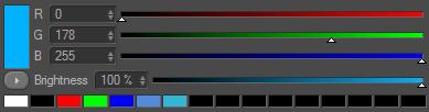
AddColorChooser
(
id, flags[, initw=80][, inith=0][, layoutflags=False][,settings=None]
)
Adds a color field with sliders to the layout.
| Parameters: |
|
||||||||||||||||||||||||||||||||||||||||||||||||||||||||||||||||||||||||||||
|---|---|---|---|---|---|---|---|---|---|---|---|---|---|---|---|---|---|---|---|---|---|---|---|---|---|---|---|---|---|---|---|---|---|---|---|---|---|---|---|---|---|---|---|---|---|---|---|---|---|---|---|---|---|---|---|---|---|---|---|---|---|---|---|---|---|---|---|---|---|---|---|---|---|---|---|---|---|
| Return type: | |||||||||||||||||||||||||||||||||||||||||||||||||||||||||||||||||||||||||||||
| Returns: |
The added gadget. |
GeDialog.
AddRadioGroup
(
id[, flags=0][, columns=0][, rows=0]
)
Adds a radio group to the layout. To add items to the radio button group use the
AddChild()
function.
| Parameters: |
|
||||||||||||||||||||||||||||
|---|---|---|---|---|---|---|---|---|---|---|---|---|---|---|---|---|---|---|---|---|---|---|---|---|---|---|---|---|---|
| Return type: |
bool |
||||||||||||||||||||||||||||
| Returns: |
True if the radio group was added, otherwise False . |
GeDialog.
AddRadioButton
(
id, flags[, initw=80][, inith=0][, name=”“]
)
Adds a radio button to the layout. Used with radio groups created with
AddRadioGroup()
.
| Parameters: |
|
||||||||||||||||||||||||||||
|---|---|---|---|---|---|---|---|---|---|---|---|---|---|---|---|---|---|---|---|---|---|---|---|---|---|---|---|---|---|
| Return type: | |||||||||||||||||||||||||||||
| Returns: |
The added gadget. |
GeDialog.
AddRadioText
(
id, flags[, initw=80][, inith=0][, name=”“]
)
Adds a text radio button to the layout (like the ones to the left in the Cinema 4D material editor). Used with radio groups created with
AddRadioGroup()
.
| Parameters: |
|
||||||||||||||||||||||||||||
|---|---|---|---|---|---|---|---|---|---|---|---|---|---|---|---|---|---|---|---|---|---|---|---|---|---|---|---|---|---|
| Return type: | |||||||||||||||||||||||||||||
| Returns: |
The added gadget. |
GeDialog.
AddPopupButton
(
id, flags[, initw=0][, inith=0]
)
New in version R19.
Adds a popup button to the layout. To add items to the popup menu use
AddChild()
or
SetPopup()
.
| Parameters: |
|
||||||||||||||||||||||||||||
|---|---|---|---|---|---|---|---|---|---|---|---|---|---|---|---|---|---|---|---|---|---|---|---|---|---|---|---|---|---|
| Return type: | |||||||||||||||||||||||||||||
| Returns: |
The added gadget. |
GeDialog.
AddSeparatorH
(
inith
[
,
flags=BFH_FIT
]
)
Adds a horizontal separator to the layout.
| Parameters: |
|
||||||||||||||||||||||||||||
|---|---|---|---|---|---|---|---|---|---|---|---|---|---|---|---|---|---|---|---|---|---|---|---|---|---|---|---|---|---|
| Return type: | |||||||||||||||||||||||||||||
| Returns: |
The added gadget. |
GeDialog.
AddSeparatorV
(
initv
[
,
flags=BFH_FIT
]
)
Adds a vertical separator to the layout.
| Parameters: |
|
||||||||||||||||||||||||||||
|---|---|---|---|---|---|---|---|---|---|---|---|---|---|---|---|---|---|---|---|---|---|---|---|---|---|---|---|---|---|
| Return type: | |||||||||||||||||||||||||||||
| Returns: |
The added gadget. |
GeDialog.
AddCustomGui
(
id
,
pluginid
,
name
,
flags
,
minw
,
minh
[
,
customdata
]
)
Adds a custom GUI to the dialog.
| Parameters: |
|
||||||||||||||||||||||||||||
|---|---|---|---|---|---|---|---|---|---|---|---|---|---|---|---|---|---|---|---|---|---|---|---|---|---|---|---|---|---|
| Return type: |
any
|
||||||||||||||||||||||||||||
| Returns: |
The custom GUI that was added, or None if an error occured. Changed in version R18.057: The method returns a
BaseCustomGui
when there is no class available for the custom GUI.
This allows to interact with any custom GUI, calling for instance
BaseCustomGui.GetData()
/
SetData()
.
|
GeDialog.
FindCustomGui
(
id
,
pluginid
)
Get the custom GUI for a certain ID. The GUI object must have been previously added with
AddCustomGui()
.
| Parameters: |
|
|---|---|
| Return type: |
any
|
| Returns: |
The found custom GUI, or None if it could not be retrieved. Changed in version R18.057: The method returns a
BaseCustomGui
when there is no class available for the custom GUI.
This allows to interact with any custom GUI, calling for instance
BaseCustomGui.GetData()
/
SetData()
.
|
GeDialog.
AddChild
(
id
,
subid
,
child
)
Adds items to combo boxes or popup buttons. The resource equivalent is CHILDS .
| Parameters: |
|
|---|---|
| Return type: |
bool |
| Returns: |
True if the child was added. |
GeDialog.
FreeChildren
(
id
,
subid
,
child
)
Clears the item list of combo boxes and popup buttons.
| Parameters: | id ( c4d.gui.C4DGadget or int ) – The control ID or int. |
|---|---|
| Return type: | bool |
| Returns: | True if the children were removed. |
GeDialog.
SetPopup
(
id
,
bc
)
New in version R19.
Sets the item list of a popup button using a popup menu container.
| Parameters: |
|
|---|---|
| Return type: |
bool |
| Returns: |
True if the popup menu was set, otherwise False . |
GeDialog.
AddChildren
(
id
,
bc
)
New in version R19.
Adds children to a dialog element using a container.
| Parameters: |
|
|---|---|
| Return type: |
bool |
| Returns: |
True if the children were added, otherwise False . |
GeDialog.
AttachUserArea
(
ua
,
id
[
,
userareaflags=USERAREA_COREMESSAGE
]
)
Assigns a
GeUserArea
object to a user area control in the dialog. The object will handle all messages to the user area and is responsible for painting the user area. A good practice is to place the
GeUserArea
derived object as a member of the
GeDialog
derived class.
| Parameters: |
|
||||||||||||
|---|---|---|---|---|---|---|---|---|---|---|---|---|---|
| Return type: |
bool |
||||||||||||
| Returns: |
True if the children were removed. |
GeDialog.
AddUserArea
(
id, flags[, initw=0][, inith=0]
)
Adds a user area to the layout. Use
AttachUserArea()
to assign a
GeUserArea
object to the user area control.
| Parameters: |
|
||||||||||||||||||||||||||||
|---|---|---|---|---|---|---|---|---|---|---|---|---|---|---|---|---|---|---|---|---|---|---|---|---|---|---|---|---|---|
| Return type: | |||||||||||||||||||||||||||||
| Returns: |
The added gadget. |
GeDialog.
AddSubDialog
(
id, flags[, initw=0][, inith=0]
)
New in version R19.
Adds a sub-dialog to the layout. Use
AttachSubDialog()
to assign a
c4d.gui.SubDialog
object to the sub-dialog control.
| Parameters: |
|
||||||||||||||||||||||||||||
|---|---|---|---|---|---|---|---|---|---|---|---|---|---|---|---|---|---|---|---|---|---|---|---|---|---|---|---|---|---|
| Return type: |
bool |
||||||||||||||||||||||||||||
| Returns: |
True if the sub-dialog was added, otherwise False . |
GeDialog.
AttachSubDialog
(
userdlg
,
id
)
New in version R19.
Attaches a
c4d.gui.SubDialog
derived object to a sub-dialog control, added with
AddSubDialog()
.
To replace the sub-dialog with another one, just call this function again.
| Parameters: |
|
|---|---|
| Return type: |
bool |
| Returns: |
True if the sub-dialog was attached, otherwise False . |
GeDialog.
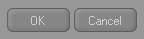
AddDlgGroup
(
type
)
Adds a dialog group with standard buttons to the layout.
Note
The dialog group contains the standard buttons of a modal dialog (OK and Cancel). By having these grouped together in a single element, Cinema 4D can change the ordering and alignment of the buttons to suit the operation system used.
| Parameters: |
type
(
int
) –
Specifies what standard buttons to include. Can be a combination of:
|
||||||||||||||||||
|---|---|---|---|---|---|---|---|---|---|---|---|---|---|---|---|---|---|---|---|
| Return type: | bool | ||||||||||||||||||
| Returns: | True if the dialog group was added, otherwise False . |
GeDialog.
GetItemDim
(
id
)
Queries a dialog control for its current position and size in pixels.
| Parameters: | id ( c4d.gui.C4DGadget or int ) – The control ID. |
|---|---|
| Return type: | dict(‘x’: int, ‘y’: int, ‘w’: int, ‘h’: int) |
| Returns: | A dictionary with the X/Y coordinates of the upper left corner and the width/height of the control. |
GeDialog.
GetDragPosition
(
msg
)
Extracts local drag coordinates from a drag and drop event.
| Parameters: | msg ( c4d.BaseContainer ) – The original message. |
|---|---|
| Return type: | dict{‘x’: int, ‘y’: int} |
| Returns: | The local X and Y position. |
GeDialog.
GetDragObject
(
msg
)
Extracts the object from a drag and drop message.
| Parameters: | msg ( c4d.BaseContainer ) – The original message. | ||||||||||||||||||||||||
|---|---|---|---|---|---|---|---|---|---|---|---|---|---|---|---|---|---|---|---|---|---|---|---|---|---|
| Return type: | dict{‘type’: int, ‘object’: any} | ||||||||||||||||||||||||
| Returns: |
The type of drag and the object itself. The types are:
|
GeDialog.
SetDragDestination
(
cursor
[
,
gadgetid=0
]
)
Sets the correct cursor during drag and drop handling.
| Parameters: |
|
||||||||||||||||||||||||||||||||||||||||||||||||||||||||||||||||||||||||||||||||||||||||||||||||
|---|---|---|---|---|---|---|---|---|---|---|---|---|---|---|---|---|---|---|---|---|---|---|---|---|---|---|---|---|---|---|---|---|---|---|---|---|---|---|---|---|---|---|---|---|---|---|---|---|---|---|---|---|---|---|---|---|---|---|---|---|---|---|---|---|---|---|---|---|---|---|---|---|---|---|---|---|---|---|---|---|---|---|---|---|---|---|---|---|---|---|---|---|---|---|---|---|---|
| Return type: |
bool |
||||||||||||||||||||||||||||||||||||||||||||||||||||||||||||||||||||||||||||||||||||||||||||||||
| Returns: |
True if the cursor could be set, otherwise False . |
GeDialog.
CheckDropArea
(
id
,
msg
,
horiz
,
vert
)
Checks the drag position in a drag event message against a certain dialog element’s position in the layout. The check can be limited to only X or Y coordinates.
| Parameters: |
|
|---|---|
| Return type: |
bool |
| Returns: |
True if the drag message is within the bounds specified, otherwise False . |
GeDialog.
GroupBeginInMenuLine
(
)
Begins a group in the menu bar of the dialog. End the group with
GroupEnd()
GeDialog.
GroupWeightsSave
(
id
)
Retrieves group weights for group id .
| Parameters: | id ( c4d.gui.C4DGadget or int ) – The control ID or int. | ||||||||||||
|---|---|---|---|---|---|---|---|---|---|---|---|---|---|
| Return type: | c4d.BaseContainer | ||||||||||||
| Returns: |
A new container with the weights or
None
.
|
GeDialog.
GroupWeightsLoad
(
id
,
weights
)
Sets group weights for group id . The group weights are absolute values. If a element has a bigger minimum size the given weight will be ignored. The sum of the weights do not need to be 100:
def CreateLayout(self):
  self.GroupBegin(GRP_SUB,c4d.BFH_SCALEFIT|c4d.BFV_SCALEFIT,2,0,"",c4d.BFV_GRIDGROUP_ALLOW_WEIGHTS)
  self.AddStaticText(1000,c4d.BFH_SCALEFIT|c4d.BFV_SCALEFIT,0,0,"SubDialog2",c4d.BORDER_THIN_IN)
  self.AddStaticText(1001,c4d.BFH_SCALEFIT|c4d.BFV_SCALEFIT,0,0,"SubDialog2",c4d.BORDER_THIN_IN)
  self.AddStaticText(1002,c4d.BFH_SCALEFIT|c4d.BFV_SCALEFIT,0,0,"SubDialog2",c4d.BORDER_THIN_IN)
  self.AddStaticText(1003,c4d.BFH_SCALEFIT|c4d.BFV_SCALEFIT,0,0,"SubDialog2",c4d.BORDER_THIN_IN)
  self.AddStaticText(1004,c4d.BFH_SCALEFIT|c4d.BFV_SCALEFIT,0,0,"SubDialog2",c4d.BORDER_THIN_IN)
  self.AddStaticText(1005,c4d.BFH_SCALEFIT|c4d.BFV_SCALEFIT,0,0,"SubDialog2",c4d.BORDER_THIN_IN)
  self.AddEditNumberArrows(1006, c4d.BFH_SCALEFIT)
  if not self.weights_saved:
      #initialization code
      self.weights.SetInt32(c4d.GROUPWEIGHTS_PERCENT_W_CNT, 2)      # number of columns - has to be equal to the given layout
      self.weights.SetFloat(c4d.GROUPWEIGHTS_PERCENT_W_VAL+0,25.0)  # weight for col 1
      self.weights.SetFloat(c4d.GROUPWEIGHTS_PERCENT_W_VAL+1,75.0)  # weight for col 2
      #set the rows
      self.weights.SetInt32(c4d.GROUPWEIGHTS_PERCENT_H_CNT,4)       # number of rows - has to be equal to the given layout
      self.weights.SetFloat(c4d.GROUPWEIGHTS_PERCENT_H_VAL+0,10.0)  # weight for row 1
      self.weights.SetFloat(c4d.GROUPWEIGHTS_PERCENT_H_VAL+1,30.0)  # weight for row 2
      self.weights.SetFloat(c4d.GROUPWEIGHTS_PERCENT_H_VAL+2,60.0)  # weight for row 3
      self.weights.SetFloat(c4d.GROUPWEIGHTS_PERCENT_H_VAL+3,0.0)   # weight for row 4
      self.weights_saved = True
  self.GroupWeightsLoad(GRP_SUB, self.weights)
  self.GroupEnd()
  return True
def Message(self, msg, result):
  if msg.GetId()==c4d.BFM_WEIGHTS_CHANGED:
    #if the weights change because of user interaction you will get notified
    if msg.GetInt32(c4d.BFM_WEIGHTS_CHANGED)==GRP_SUB:
      self.weights = self.GroupWeightsSave(GRP_SUB)
  return GeDialog.Message(self, msg, result)
| Parameters: |
|
||||||||||||
|---|---|---|---|---|---|---|---|---|---|---|---|---|---|
| Return type: |
bool |
||||||||||||
| Returns: |
True if the group weights could be set, otherwise False . |
GeDialog.
ScrollGroupBegin
(
id, flags, scrollflags[, initw=0][, inith=0]
)
Begins a scrollgroup.
| Parameters: |
|
||||||||||||||||||||||||||||||||||||||||||||||||||
|---|---|---|---|---|---|---|---|---|---|---|---|---|---|---|---|---|---|---|---|---|---|---|---|---|---|---|---|---|---|---|---|---|---|---|---|---|---|---|---|---|---|---|---|---|---|---|---|---|---|---|---|
| Return type: |
bool |
||||||||||||||||||||||||||||||||||||||||||||||||||
| Returns: |
True if scrollgroup was added. |
GeDialog.
LayoutChanged
(
id
)
Notifies Cinema 4D that the layout of a dynamic group in the dialog has changed. This is usually done by first calling
LayoutFlushGroup()
and then adding new controls.
| Parameters: | id ( int ) – The ID of the changed group. |
|---|---|
| Return type: | bool |
| Returns: | True if the layout was updated, otherwise False . |
GeDialog.
LayoutChangedNoRedraw
(
id
)
Notifies Cinema 4D that the layout of a dynamic group in the dialog has changed. This is usually done by first calling
LayoutFlushGroup()
and then adding new controls.
| Parameters: | id ( c4d.gui.C4DGadget or int ) – The ID of the changed group. |
|---|---|
| Return type: | bool |
| Returns: | True if the layout was updated, otherwise False . |
GeDialog.
Activate
(
id
)
Sets the focus to a specific control within the dialog.
| Parameters: | id ( int ) – The control ID. |
|---|---|
| Return type: | bool |
| Returns: | True if the control was activated. |
GeDialog.
IsActive
(
id
)
Checks if the given gadget has the focus.
| Parameters: | id ( int ) – The control ID. |
|---|---|
| Return type: | bool |
| Returns: | True if the control is active, otherwise False . |
GeDialog.
LayoutFlushGroup
(
id
)
Removes all controls from a group and places the control insertion point within the group. This makes it possible to have dynamic groups. After all components are added call
LayoutChanged()
with the group ID.
| Parameters: | id ( int ) – The control ID. |
|---|---|
| Return type: | bool |
| Returns: | True if the group was flushed. |
GeDialog.
RemoveElement
(
id
)
Removes an element from the dialog.
| Parameters: | id ( int ) – The control ID. |
|---|---|
| Return type: | bool |
| Returns: | True if the element was removed. |
GeDialog.
HideElement
(
id
,
hide
)
Hides/unhides an element from the dialog.
| Parameters: |
|
|---|---|
| Return type: |
bool |
| Returns: |
True if the element was hidden/unhidden. |
GeDialog.
MenuFlushAll
(
)
Flushes the menu bar of the dialog, removing all menus. Add menus with
MenuSubBegin()
. Call
MenuFinished()
when all menus and items have been added.
| Return type: | bool |
|---|---|
| Returns: | True if the menu bar was flushed. |
GeDialog.
MenuSubBegin
(
string
)
Creates a new menu group. At the top level this means a menu, at lower levels a sub-menu. Add items with
MenuAddCommand()
,
MenuAddString()
or
MenuAddSeparator()
. Call
MenuSubEnd()
when the menu is finished.
| Parameters: | string ( str ) – Name of the sub menu. |
|---|---|
| Return type: | bool |
| Returns: | True if a menu group could be begun. |
GeDialog.
MenuSubEnd
(
)
Closes the current menu group, opened with
MenuSubBegin()
.
| Return type: | bool |
|---|---|
| Returns: | True if the menu group was ended, otherwise False . |
GeDialog.
MenuAddCommand
(
cmdid
)
Adds a command item to the current menu. This can either be a Cinema 4D command or a plugin command. Particularly useful is IDM_CM_CLOSEWINDOW to add a close item for dialogs.
| Parameters: | cmdid ( int ) – A Cinema 4D command id or a plugin ID. |
|---|---|
| Return type: | bool |
| Returns: | True if the command was added. |
GeDialog.
MenuAddString
(
id
,
string
)
Adds a string item to the current menu.
Command()
will be called when the menu item is selected.
| Parameters: |
|
|---|---|
| Return type: |
bool |
| Returns: |
True if the menu item was added, otherwise False . |
GeDialog.
MenuAddSeparator
(
)
Adds a separator to the current menu.
| Parameters: | id ( int ) – The item ID. |
|---|---|
| Return type: | bool |
| Returns: | True if a seperator was added. |
GeDialog.
MenuFinished
(
)
Call this function when all menus and all items have been added.
| Parameters: | id ( int ) – The item ID. |
|---|---|
| Return type: | bool |
| Returns: | True if a seperator was added. |
GeDialog.
MenuInitString
(
id
,
enabled
,
value
)
Used to change the enabled/disabled and checked/unchecked state of menu items. Can be called after
MenuFinished()
to update the menu item dynamically.
| Parameters: |
|
|---|---|
| Return type: |
bool |
| Returns: |
True if the item was set. |
GeDialog.
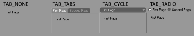
TabGroupBegin
(
id
,
flags
[
,
tabtype=TAB_TABS
]
)
Begins a tab group.
| Parameters: |
|
||||||||||||||||||||||||||||||||||||
|---|---|---|---|---|---|---|---|---|---|---|---|---|---|---|---|---|---|---|---|---|---|---|---|---|---|---|---|---|---|---|---|---|---|---|---|---|---|
| Return type: |
bool |
||||||||||||||||||||||||||||||||||||
| Returns: |
True if a tab group could be begun, otherwise False . |
GeDialog.
GroupBegin
(
id, flags[, cols=0][, rows=0][, title=”“][, groupflags=0],[initw=0][, inith=0]
)
Begins a group.
| Parameters: |
|
||||||||||||||||||||||||||||||||||||||||||||||||||||||||||||||||
|---|---|---|---|---|---|---|---|---|---|---|---|---|---|---|---|---|---|---|---|---|---|---|---|---|---|---|---|---|---|---|---|---|---|---|---|---|---|---|---|---|---|---|---|---|---|---|---|---|---|---|---|---|---|---|---|---|---|---|---|---|---|---|---|---|---|
| Return type: |
bool |
||||||||||||||||||||||||||||||||||||||||||||||||||||||||||||||||
| Returns: |
True if a group could be begun, otherwise False . |
GeDialog.
GroupEnd
(
)
Ends groups.
| Return type: | bool |
|---|---|
| Returns: | True if the group was ended, otherwise False . |
GeDialog.
GroupSpace
(
spacex
,
spacey
)
Sets the space in pixels between two elements in the current group. Equivalent to SPACE in dialog resources.
| Parameters: |
|
|---|---|
| Return type: |
bool |
| Returns: |
True if the spacing could be set. |
GeDialog.
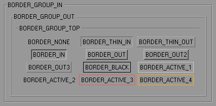
GroupBorder
(
borderstyle
)
Sets the border type of the current group, and displays the title in the border if possible.
Note
Use
GroupBorderNoTitle()
if you do not have a title. Otherwise there’ll be a small gap in the border where the title would be.
| Parameters: |
borderstyle
(
int
) –
The style:
|
|---|
GeDialog.
GroupBorderNoTitle
(
borderstyle
)
Sets the border type of the current group, and displays the title in the border if possible.
| Parameters: |
borderstyle
(
int
) –
The style:
|
|---|
GeDialog.
GroupBorderSpace
(
left
,
top
,
right
,
bottom
)
Sets the border size around the current group in pixels.
| Parameters: |
|
|---|---|
| Return type: |
bool |
| Returns: |
True if the border space was set. |
GeDialog.
Close
(
)
Close the dialog.
| Return type: | bool |
|---|---|
| Returns: | True if successfully closed, otherwise False . |
GeDialog.
SendMessage
(
gadget
,
value
)
Sends a message to a dialog gadget.
| Parameters: |
|
|---|---|
| Return type: |
object |
| Returns: |
Depends on the message. |
GeDialog.
SendParentMessage
(
msg
)
Sends a message to the parent dialog.
| Parameters: | msg ( c4d.BaseContainer ) – The message container. |
|---|---|
| Return type: | bool |
| Returns: | True if the message was sent. |
GeDialog.
GetId
(
)
Gets the dialog ID.
| Return type: | int |
|---|---|
| Returns: | The id. |
GeDialog.
IsVisible
(
)
Checks if the dialog is visible.
| Return type: | bool |
|---|---|
| Returns: | True if it is visible, otherwise False . |
GeDialog.
IsOpen
(
)
Checks if the dialog is open.
| Return type: | bool |
|---|---|
| Returns: | True if it is open, otherwise False . |
GeDialog.
SetTimer
(
value
)
Initializes the timer clock, so that
Timer()
is called every timer milliseconds. Use
SetTimer()
(0) to stop the clock.
Note
Depending on the speed of the computer, the operating system, the complexity of the dialog and the threads running in the background, there is no guarantuee that event messages will occur on a regular basis. Using a value of 500 ms should be no problem but if using a value of 1 ms one might get events with the following time spaces: 3 ms, 76 ms, 15 ms, 19 ms, 67 ms…
Note
The timer will be paused while a synchronous dialog is opened in Cinema 4D.
Warning
Keep in mind that using small timer values results in heavy message traffic in the application which may slow down Cinema 4D.
| Parameters: | value ( int ) – The timer interval in milliseconds. |
|---|
GeDialog.
SetTitle
(
title
)
Sets the title of the dialog window.
| Parameters: | title ( str ) – The title. |
|---|
GeDialog.
Enable
(
gadget
,
enable
)
Enables or disables the dialog gadget, depending on the value of enable .
| Parameters: |
|
|---|
GeDialog.
LoadDialogResource
(
id[, lr=None][, flags=0]
)
Loads an external resource file. This is the prefered method for dialog layout since it gives maximum flexibility and easy multi language support. The dialog loaded is automatically surrounded by an additional outer group, so flags means the same as with dialog groups (e.g. BFV_CENTER ).
| Parameters: |
|
|---|
GeDialog.
SetBool
(
id
,
value
)
Sets the value of checkbox controls.
| Parameters: |
|
|---|---|
| Return type: |
bool |
| Returns: |
True if the value was set. |
GeDialog.
SetLong
(
id, value[, min=MINLONGl][, max=MAXLONGl][, step=1][, tristate=False][, min2=MINLONGl][, max2=MAXLONGl]
)
Deprecated since version R15:
Use
SetInt32()
instead.
Sets the value and limits of integer fields. Also used for tab groups, radio buttons and combo boxes.
| Parameters: |
|
|---|---|
| Return type: |
bool |
| Returns: |
True if the value was set. |
GeDialog.
SetInt32
(
id, value[, min=MINLONGl][, max=MAXLONGl][, step=1][, tristate=False][, min2=MINLONGl][, max2=MAXLONGl]
)
New in version R15.037.
Sets the value and limits of integer fields. Also used for tab groups, radio buttons and combo boxes.
| Parameters: |
|
|---|---|
| Return type: |
bool |
| Returns: |
True if the value was set. |
GeDialog.
SetReal
(
id, value[, min=sys.float_info.min][, max=sys.float_info.max][, step=1.0][, format=FORMAT_FLOAT][, min2=0.0][, max2=0.0][, quadscale=False][, tristate=False]
)
Deprecated since version R15:
Use
SetFloat()
instead.
Sets the value, unit and limits of float fields.
| Parameters: |
|
||||||||||||||||
|---|---|---|---|---|---|---|---|---|---|---|---|---|---|---|---|---|---|
| Return type: |
bool |
||||||||||||||||
| Returns: |
True if the value was set. |
GeDialog.
SetFloat
(
id, value[, min=sys.float_info.min][, max=sys.float_info.max][, step=1.0][, format=FORMAT_FLOAT][, min2=0.0][, max2=0.0][, quadscale=False][, tristate=False]
)
New in version R15.037.
Sets the value, unit and limits of float fields.
| Parameters: |
|
||||||||||||||||
|---|---|---|---|---|---|---|---|---|---|---|---|---|---|---|---|---|---|
| Return type: |
bool |
||||||||||||||||
| Returns: |
True if the value was set. |
GeDialog.
SetMeter
(
id, value[, min=sys.float_info.min][, max=sys.float_info.max][, step=1.0][, tristate=False]
)
Sets the value and limits of a meter field. Same as
SetFloat()
with
FORMAT_METER
.
| Parameters: |
|
|---|---|
| Return type: |
bool |
| Returns: |
True if the value was set. |
GeDialog.
SetDegree
(
id, value[, min=sys.float_info.min][, max=sys.float_info.max][, step=1.0][, tristate=False]
)
Sets the value and limits of an angle field. Same as
SetFloat()
with
FORMAT_DEGREE
.
| Parameters: |
|
|---|---|
| Return type: |
bool |
| Returns: |
True if the value was set. |
GeDialog.
SetPercent
(
id, value[, min=0.0][, max=100.0][, step=1.0][, tristate=False]
)
Sets the value and limits of a percent field. Same as
SetFloat()
with
FORMAT_PERCENT
.
| Parameters: |
|
|---|---|
| Return type: |
bool |
| Returns: |
True if the value was set. |
GeDialog.
SetTime
(
id, doc, value[, min=-MAXTIME][, max=MAXTIME][, stepframes=1][, tristate=False]
)
Sets the value and limits of a time field. Same as
SetFloat()
with
FORMAT_FRAMES
.
| Parameters: |
|
|---|---|
| Return type: |
bool |
| Returns: |
True if the value was set. |
GeDialog.
SetString
(
id, value[, tristate=False][, flags=0]
)
Sets the text of string controls. Used for all controls that have a text, for example static text fields, edit fields, buttons and checkboxes.
| Parameters: |
|
||||
|---|---|---|---|---|---|
| Return type: |
bool |
||||
| Returns: |
True if the value was set. |
GeDialog.
SetColorField
(
id
,
color
,
brightness
,
maxbrightness
,
flags
)
Sets the color, brightness and limits of color fields and color choosers.
| Parameters: |
|
||||||||||||||||||||||||||||||||||||||||||||||||
|---|---|---|---|---|---|---|---|---|---|---|---|---|---|---|---|---|---|---|---|---|---|---|---|---|---|---|---|---|---|---|---|---|---|---|---|---|---|---|---|---|---|---|---|---|---|---|---|---|---|
| Return type: |
bool |
||||||||||||||||||||||||||||||||||||||||||||||||
| Returns: |
True if the value was set. |
GeDialog.
SetFilename
(
id
,
fn
[
,
tristate=False
]
)
Sets the text of string controls, taking the new value from a filename.
| Parameters: |
|
|---|---|
| Return type: |
bool |
| Returns: |
True if the value was set. |
GeDialog.
SetMultiLinePos
(
id
,
line
,
pos
)
Set the cursor position within a dialog multi-line string item.
| Parameters: |
|
|---|---|
| Return type: |
bool |
| Returns: |
True if successful, otherwise False . |
GeDialog.
SetMultiLineMode
(
id
,
mode
)
Sets the edit mode for multi-line edit fields.
| Parameters: |
|
||||||
|---|---|---|---|---|---|---|---|
| Return type: |
bool |
||||||
| Returns: |
True if the multi-line mode was set, otherwise False . |
GeDialog.
GetBool
(
id
)
Retrieves the value of checkbox controls.
| Parameters: | id ( c4d.gui.C4DGadget or int ) – The control ID or int. |
|---|---|
| Return type: | bool |
| Returns: | The value or None if the value was not retrieved. |
GeDialog.
GetLong
(
id
)
Deprecated since version R15:
Use
GetInt32()
instead.
Retrieves the value of integer fields. Also used for tab groups, radio buttons and combo boxes.
| Parameters: | id ( c4d.gui.C4DGadget or int ) – The control ID or int. |
|---|---|
| Return type: | int |
| Returns: | The value or None if the value was not retrieved. |
GeDialog.
GetInt32
(
id
)
New in version R15.037.
Retrieves the value of integer fields. Also used for tab groups, radio buttons and combo boxes.
| Parameters: | id ( c4d.gui.C4DGadget or int ) – The control ID or int. |
|---|---|
| Return type: | int |
| Returns: | The value or None if the value was not retrieved. |
GeDialog.
GetReal
(
id
)
Deprecated since version R15:
Use
GetFloat()
instead.
Retrieves the value of float fields.
| Parameters: | id ( c4d.gui.C4DGadget or int ) – The control ID or int. |
|---|---|
| Return type: | float |
| Returns: | The value or None if the value was not retrieved. |
GeDialog.
GetFloat
(
id
)
New in version R15.037.
Retrieves the value of float fields.
| Parameters: | id ( c4d.gui.C4DGadget or int ) – The control ID or int. |
|---|---|
| Return type: | float |
| Returns: | The value or None if the value was not retrieved. |
GeDialog.
GetVector
(
id_x
,
id_y
,
id_z
)
Retrieves the value of three float fields at the same time as a vector.
| Parameters: |
|
|---|---|
| Return type: |
|
| Returns: |
The value or None if the value was not retrieved. |
GeDialog.
GetString
(
id
)
Retrieves the text from string controls. Used for all controls that have a text, for example static text fields, edit fields, buttons and checkboxes.
| Parameters: | id ( c4d.gui.C4DGadget or int ) – The control ID or int. |
|---|---|
| Return type: | str |
| Returns: | The value or None if the value was not retrieved. |
GeDialog.
GetColorField
(
id
)
Retrieves the color and brightness of color controls.
| Parameters: | id ( c4d.gui.C4DGadget or int ) – The control ID or int. |
|---|---|
| Return type: |
dict{
brightness
: float,
color
:
Vector
}
|
| Returns: | The value or None if the value was not retrieved. |
GeDialog.
GetTime
(
id
,
doc
)
Retrieves the time of time fields.
| Parameters: |
|
|---|---|
| Return type: | |
| Returns: |
The time or None if the value was not retrieved. |
GeDialog.
GetFilename
(
id
)
Retrieves the text from string controls as a filename.
| Parameters: | id ( c4d.gui.C4DGadget or int ) – The control ID or int. |
|---|---|
| Return type: | str |
| Returns: | The time or None if the value was not retrieved. |
GeDialog.
CheckTristateChange
(
id
)
Indicates wheter a control’s content has been changed since the last time its value was set manually with.
| Parameters: | id ( c4d.gui.C4DGadget or int ) – The control ID or int. |
|---|---|
| Return type: | bool |
| Returns: | True if the control has been changed, otherwise False . |
GeDialog.
GetVisibleArea
(
scrollgroup
)
Queries a scroll group for its currently visible region, a rectangle between ( x1,y1 ) and ( x2,y2 ). The coordinates are in pixels.
| Parameters: | scrollgroup ( int ) – The scroll group ID. |
|---|---|
| Return type: | dict{ x1 : int, y1 : int, x2 : int, y2 : int } |
| Returns: | The visible area in coordinates, in keys x1 , y1 , x2 , y2 . |
GeDialog.
SetVisibleArea
(
scrollgroupid
,
x1
,
y1
,
x2
,
y2
)
Scrolls a scroll group so that the rectangle between ( x1,y1 ) and ( x2,y2 ) is visible. The coordinates are in pixels. If the area is smaller than the scroll group then it is moved only as much as necessary. If the area is bigger than the scroll group then the top left corners are aligned.
| Parameters: |
|
|---|---|
| Return type: |
bool |
| Returns: |
True if the group was scrolled or already had the right view. |
GeDialog.
GetType
(
id
)
Private.